Personal Project*
October 2022 - January 2023
THE CHALLENGE
Many users find a similar problem with their smartphone gallery: waaaay too many items to delete 😫
As a smartphone user, I realized that my gallery, like many around me, was filled with selfies, duplicates, screenshots and memes that were only stealing storage space and that I wanted to get rid of. And, even after deleting bunches and bunches of archives every now and then, my gallery was only growing larger and larger.
THE RESEARCH
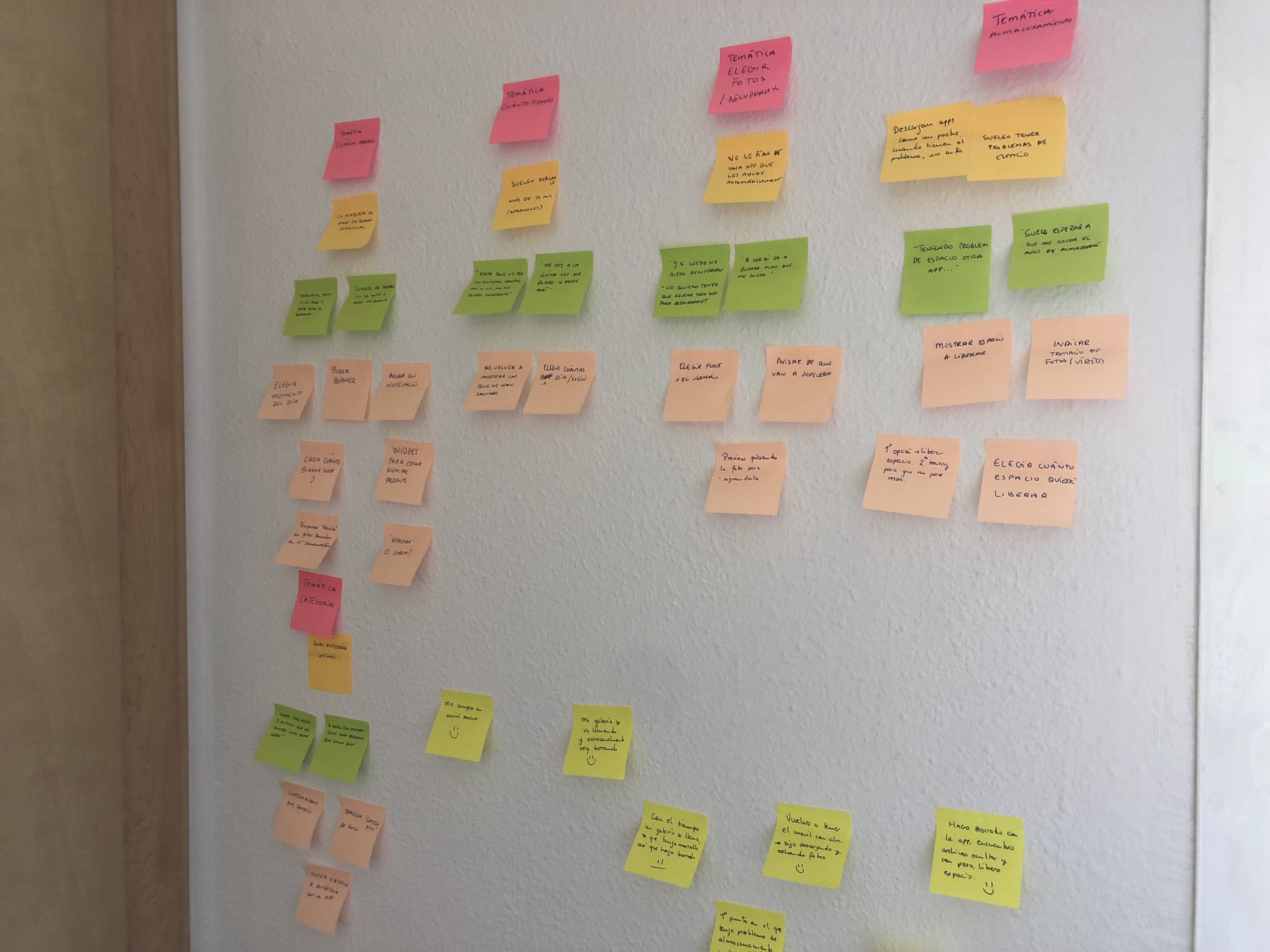
To help me engage with the problem, I conducted a survey and held some interviews with friends, family and colleagues. These were the main takeaways.
![]()
100% of respondents confirmed having experienced at least once storage problems because of the size of their gallery. But the problem wasn’t even only about storage: they all admitted just wanting a cleaner and more organized gallery, even if they were not having storage problems in their smartphones.
Having a large gallery made users perceive the task of cleaning their gallery as difficult, resulting in most of them putting it off
84% of respondents said they cleaned their smartphone only occasionally. Personal interviews helped me understand better how that cleaning is usually made: most of us only clean our phones in our spare time (when travelling or when we are out-of-signal), deleting between 100 and 300 items in each session according to the survey.
Nonetheless, 100% of the respondants agreed that a more constant routine would definitely help in maintaining a more organized photo gallery.
One of the survey’s sections tested possible solutions or functionalities that could help users. One of them was rejected by all respondants: automatically choosing the photos and videos that would be deleted.
Nobody wants to delete important pictures or videos by mistake. The user wants to be the one who decides how items get filtered and which get deleted.
To help me engage with the problem, I conducted a survey and held some interviews with friends, family and colleagues. These were the main takeaways.
1. Cleaning is not just a matter of storage space, it’s also about order
100% of respondents confirmed having experienced at least once storage problems because of the size of their gallery. But the problem wasn’t even only about storage: they all admitted just wanting a cleaner and more organized gallery, even if they were not having storage problems in their smartphones.
Having a large gallery made users perceive the task of cleaning their gallery as difficult, resulting in most of them putting it off
2. Most of us do it every now and then, not on a constant basis
84% of respondents said they cleaned their smartphone only occasionally. Personal interviews helped me understand better how that cleaning is usually made: most of us only clean our phones in our spare time (when travelling or when we are out-of-signal), deleting between 100 and 300 items in each session according to the survey.
Nonetheless, 100% of the respondants agreed that a more constant routine would definitely help in maintaining a more organized photo gallery.
3. We want full control in what we delete
One of the survey’s sections tested possible solutions or functionalities that could help users. One of them was rejected by all respondants: automatically choosing the photos and videos that would be deleted.
Nobody wants to delete important pictures or videos by mistake. The user wants to be the one who decides how items get filtered and which get deleted.
COMPETITORS’ ANALYSIS
After my research, I am convinced that the best solution is to help the user create and keep an organization routine that took as little effort as possible. I looked through every app that offered phone cleaning services: all of them focused on massive cleanings and keeping track on the smartphone’s storage space status.
They all addressed the same problem: a user's lack of free storage space, not a chaotic gallery.
![]()
Furthermore, only 16% of respondants had ever used one of these apps.
Other cleaning apps focus on bulk cleaning rather than promoting and maintaining a cleaning habit🧹️
After my research, I am convinced that the best solution is to help the user create and keep an organization routine that took as little effort as possible. I looked through every app that offered phone cleaning services: all of them focused on massive cleanings and keeping track on the smartphone’s storage space status.
They all addressed the same problem: a user's lack of free storage space, not a chaotic gallery.

Furthermore, only 16% of respondants had ever used one of these apps.
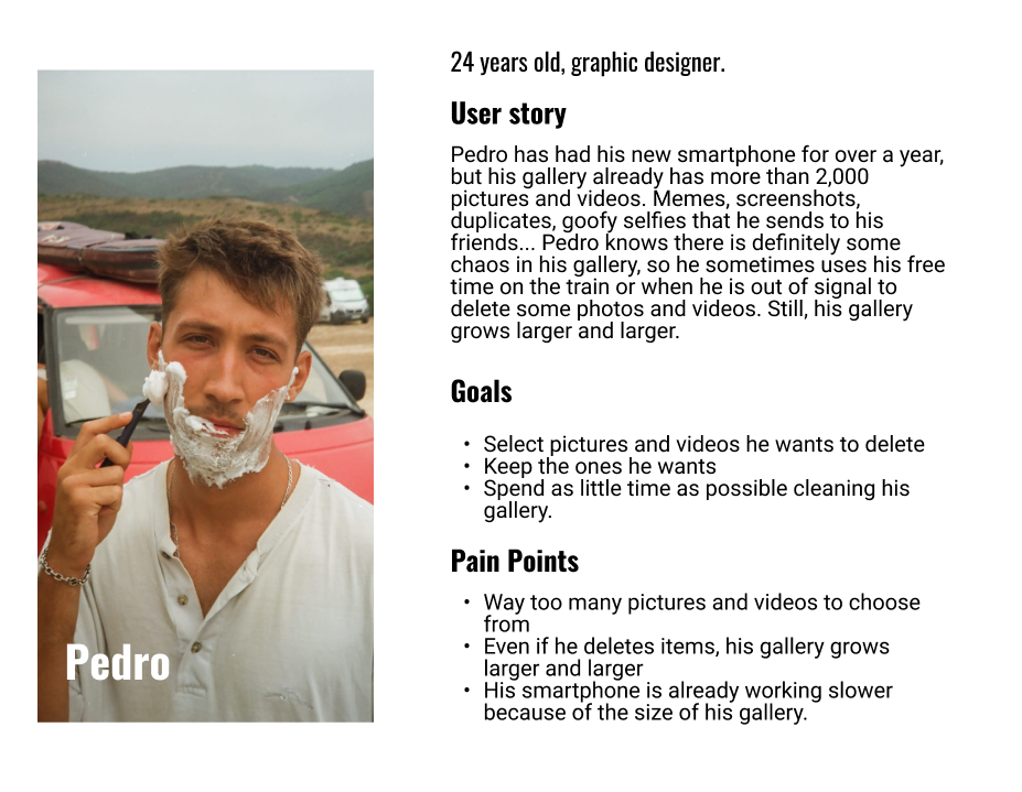
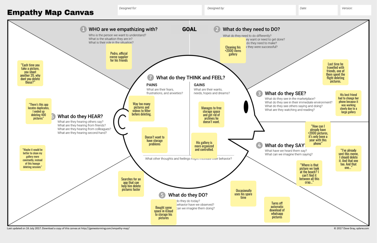
USER PERSONA
![]()
![]()
DESIGN PROCESS
With the information gathered in previous steps, I started brainstorming different solutions and functionalities through the Value Proposition Canvas and MOSCOW.
I decided that the best way to solve the problem was to create an app that would help users keeping up a “gallery cleaning” routine in the simplest and least intrusive way , with notifications to encourage the user to stick to a digital cleaning routine.
![]()
With the information gathered in previous steps, I started brainstorming different solutions and functionalities through the Value Proposition Canvas and MOSCOW.
I decided that the best way to solve the problem was to create an app that would help users keeping up a “gallery cleaning” routine in the simplest and least intrusive way , with notifications to encourage the user to stick to a digital cleaning routine.
BRAND PERSONALITY
Before starting wireframing any screen, I wanted to define a unique personality and voice for the brand/app. This would help it differentiate from similar apps that were not being used by my target audience, and make the task less intrusive for the user.
Inspired by celebrities, brands and campaigns, as well as the wording in other routines such as skincare, I decided that my app would be more like a friend that helps you keep your shit together and your head up, rather than a cold service about numbers and MBs.
![]()
This personality and voice shines in every interaction with the app: from its own name to notifications or empty states.
![]()
B*tch, you better be cleaning your gallery! 💅🏽 💅🏽
Before starting wireframing any screen, I wanted to define a unique personality and voice for the brand/app. This would help it differentiate from similar apps that were not being used by my target audience, and make the task less intrusive for the user.
Inspired by celebrities, brands and campaigns, as well as the wording in other routines such as skincare, I decided that my app would be more like a friend that helps you keep your shit together and your head up, rather than a cold service about numbers and MBs.
This personality and voice shines in every interaction with the app: from its own name to notifications or empty states.
THE FINAL DESIGN
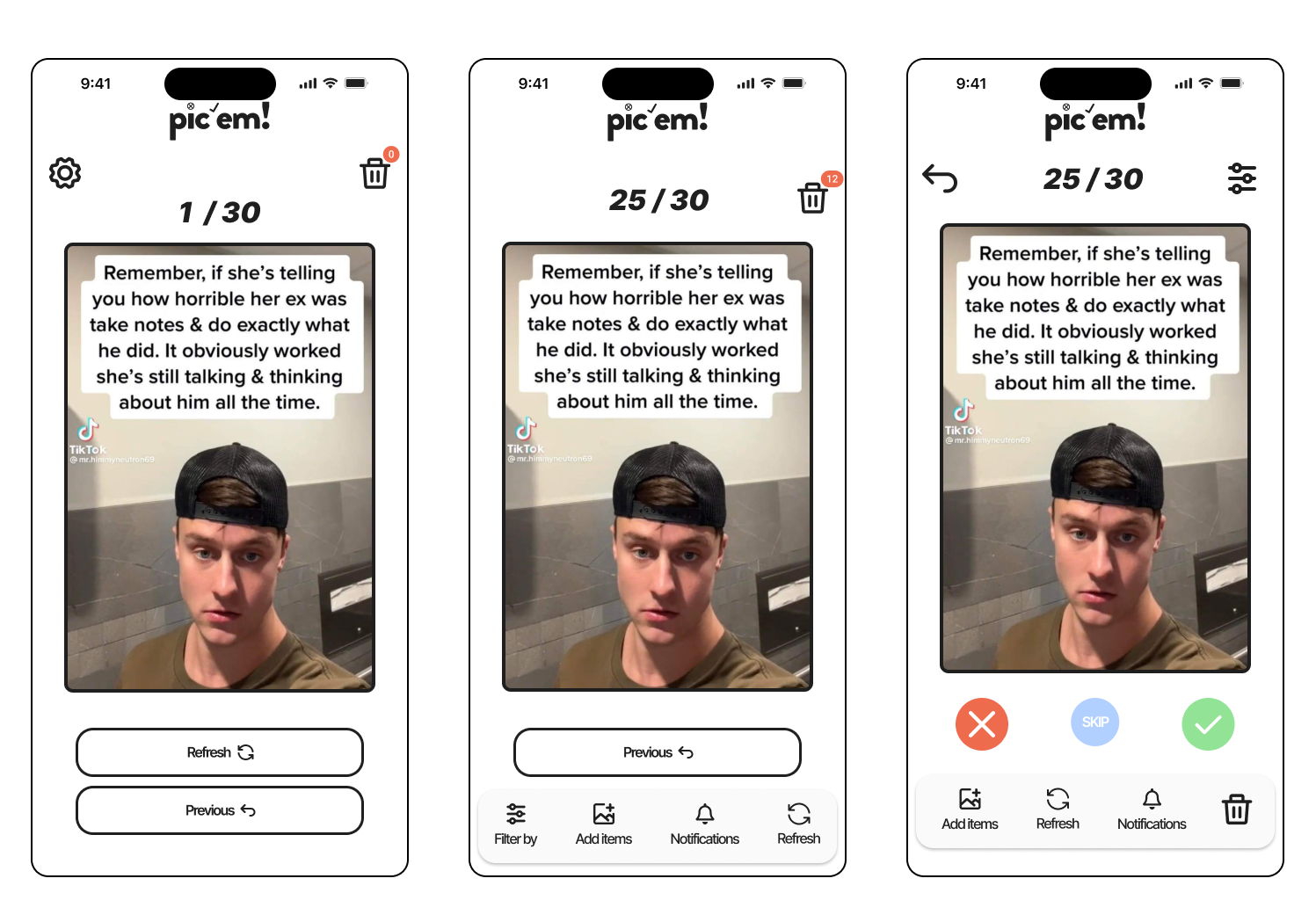
Following two weeks wireframing different mechanics on paper sheets, I decided to imitate dating apps such as Tinder or Bumble in order to make the task be as simple and fun as possible. This decision was also made based on my main target: young people between 20-35 years, familiar with this kind of mechanic.
![]()
![]()
I also experimented with exploring functionalities related to deleting apps, documents and other kind of archives, but I ended up discarding it since it added some unnecesary difficulties.
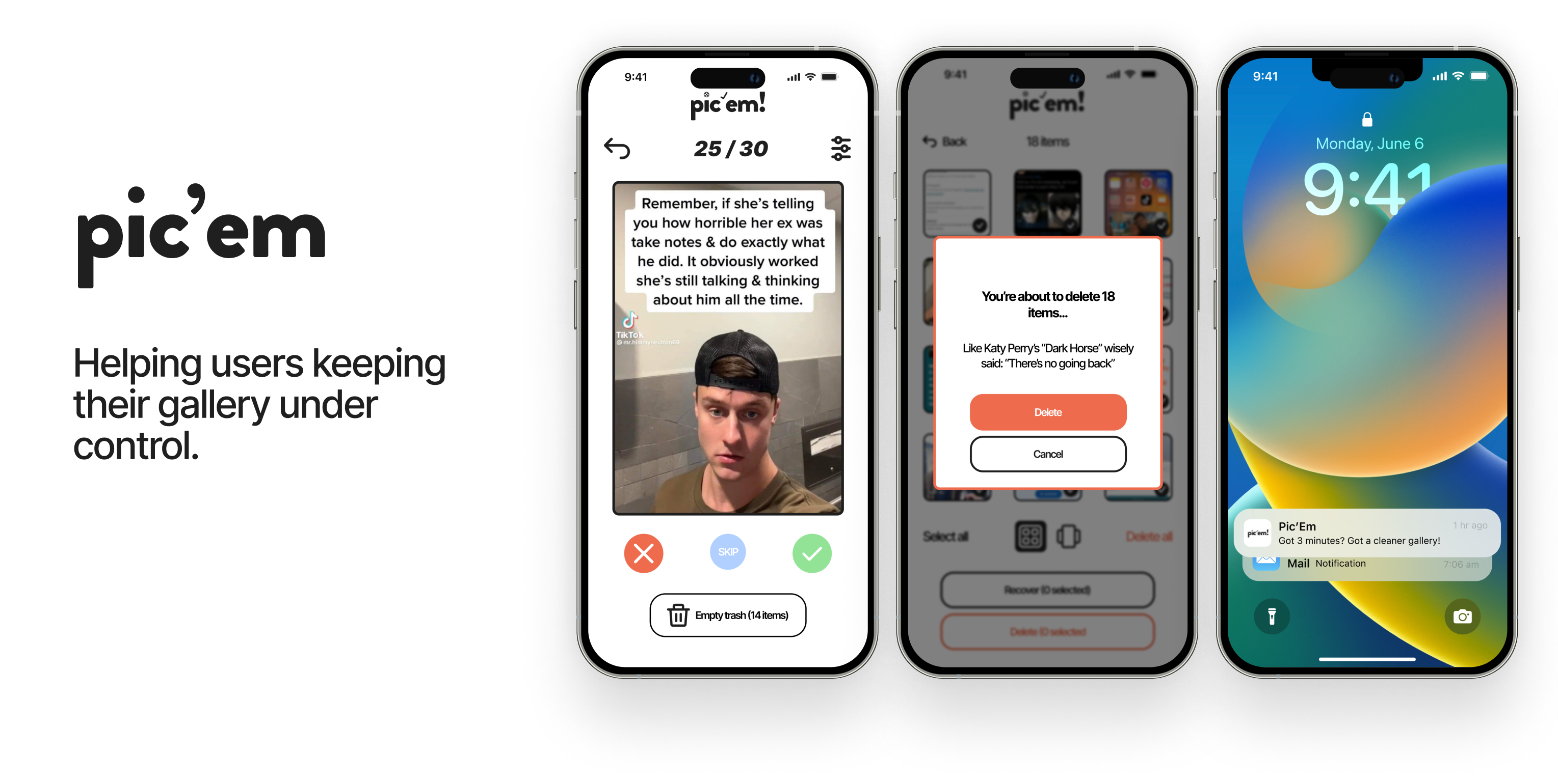
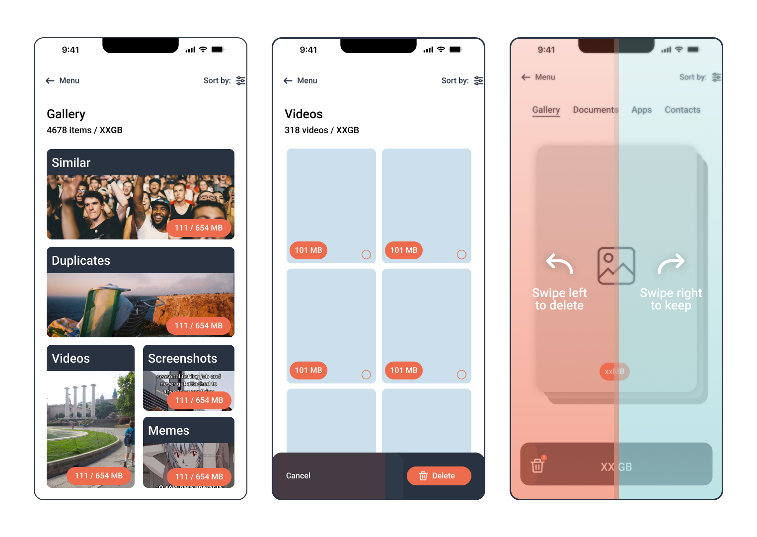
Instead of offering a massive cleaning of all items in the gallery, I established 30 as the number of items the user would “filter” daily: it was an intermediate number that made the task look easy and plausible. It also meant having filtered through 210 pictures at the end of the week, a number that matched the one respondents had said to delete in every session in my survey.
After iterating and sharing my work with UX professionals, I simplified my interface to 4 main actions: delete, keep, skip and rewind. I also added a button to manage Trash (Pic’em would not permanently delete anything unless the user chose to) and a drop down menu to filter archives between different categories, one of the main funcionalitys respondants found most interesting.
![]()
30 items a day, with a Tinder “Swipe” mechanic
Following two weeks wireframing different mechanics on paper sheets, I decided to imitate dating apps such as Tinder or Bumble in order to make the task be as simple and fun as possible. This decision was also made based on my main target: young people between 20-35 years, familiar with this kind of mechanic.
I also experimented with exploring functionalities related to deleting apps, documents and other kind of archives, but I ended up discarding it since it added some unnecesary difficulties.
Instead of offering a massive cleaning of all items in the gallery, I established 30 as the number of items the user would “filter” daily: it was an intermediate number that made the task look easy and plausible. It also meant having filtered through 210 pictures at the end of the week, a number that matched the one respondents had said to delete in every session in my survey.
After iterating and sharing my work with UX professionals, I simplified my interface to 4 main actions: delete, keep, skip and rewind. I also added a button to manage Trash (Pic’em would not permanently delete anything unless the user chose to) and a drop down menu to filter archives between different categories, one of the main funcionalitys respondants found most interesting.
THE FINAL PRODUCT
